Opaque mechanics in Shop Heroes
Shop Heroes is an item-shop game released on mobile and Kongregate in mid 2014 by CloudCade. The gameplay consists of crafting equipment for heroes, who then go on quests to find materials, which are used to craft more equipment. Players can gather in Towns to share the costs incurred by leveling up buildings, which unlock more heroes and quests.
CloudCade advertises striving for useability and superior gameplay. I understand that when they launched Shop Heroes, they were still a small studio. But their UI needs more work: it has too many screens, too many taps to start an action, too much information, and fragmentation/duplicate information. Sometimes, information is not just missing or duplicated. It’s purposefully hidden, misleading, or manipulative.
Misleading expectations
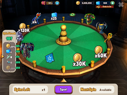
An example of UI misleading expectations is the Roulette, which gives players one random award among 12. The UI shows each award equally likely to happen - 1 in 12, or 8% each. Yet the actual chance of keys, gems, and blueprint fragments is less than 1%. Why raise players' hopes so high if it never delivers? So they get 10 seconds of fiero after 10 months of frustration? It's as if a slot machine displayed the jackpot symbol with the same chance as others, but was actually rigged to nearly never stop on it. The gambling industry actually forbids such machines. One could argue that the Roulette is a minor mechanic in Shop Heroes, and that players may understand that it's rigged. But a honest UI would make the area of a reward on the wheel proportional to its likelihood.

Hiding information
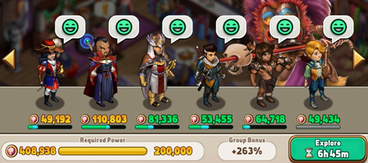
An example of UI purposefully hidding important information can be found in the screen where players build their quest teams. Players send heroes on quests dozens of times per day. When heroes are strong enough to tackle the quest, a green smiley is displayed above their head. When they are not strong enough, the smiley turns to yellow or red, showing that they are more likely to be injured. Injured heroes are unusable for several hours, so players strive for green smileys. But each of the 8 equipment slots of each hero has a 1-10% chance to break during a quest. Therefore players equip their heroes with just enough equipment to reach green smileys, so as to minimize the costs incurred by broken equipment.

Yet players noticed discrepancies in the odds of injury. They asked on the forum whether increasing power above green smiley reduces the chance of injury. The community manager did not answer clearly at first, saying it's fun for those playing to figure out, and that it's impossible to create a tutorial for every single detail in the game
. Players replied that 1) they are not asking for a tutorial but for explicit numbers to be displayed, 2) core mechanics should not be hidden, and 3) discovering 1%-likelihood mechanics is annoying and time-consuming. The community manager eventually cleared the matter, but why was this important information not explicitly provided inside the game? The in-game UI should, and can, do a better job at displaying the chance of injury, however small it is. One way would be to display the green smiley only when the chance is exactly 0%. Another way would be to display the percentage number, rounded up (0.123% would be 1%). Providing feedback through numbers is the only way that hardcore players can theorycraft and reverse-engineer the most intricate mechanics.